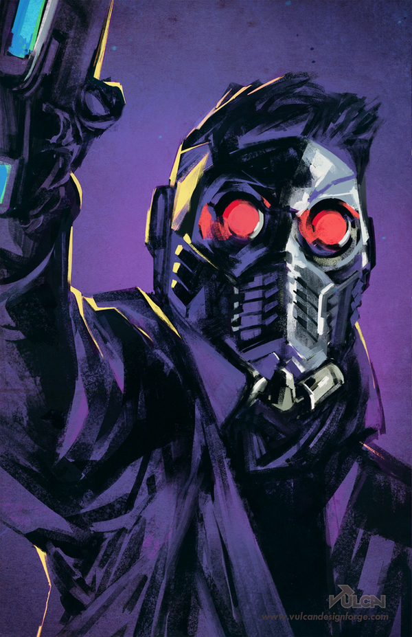
Marvel Guardians - Star Lord fan art by tomafeizogas
When I thought of non-commercial art, I honestly struggled to think of any art that had no connections to not making money in some way. But then I remembered the vast amount of fan made artwork that is on the internet. This is just one example of a piece made simply to show off artistic skill and to grow ones portfolio. I enjoy it for its art style of heavy shading and the mostly monochrome color scheme (of my favorite color).
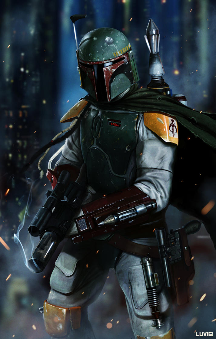
Boba Fett - No Disintegrations by DanLuVisiArt
This piece like my other example is a work of fan made art, and an honestly amazing looking one at that. When I first saw this piece I was convinced it was a picture of someone in a costume with effects added in afterwards, but that's just the kind of amazing detail that this picture is made in. It looks better every time I see it, and I think that constitutes a great piece of artwork.