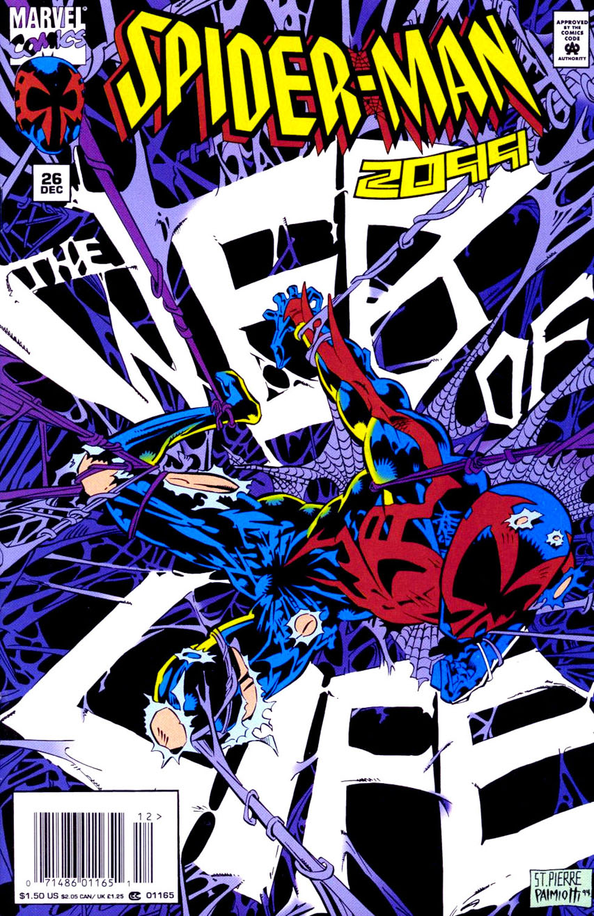
Spider-Man 2099 #26
When I heard "colors" as this weeks image themes, my mind immediately went to a place where I was familiar, comics. My first selection shows analogous harmony with the usage of the blues on spider man, the darker blues in the background, and the purple webs entangling him.

Avengers #57
Next up for monochromatic, a very iconic cover for the Avengers. The various shades of red give a real ominous and dangerous feeling to the cover, conveying the then unknown new villain on the scene.

Jungle Action #23
Next for complimentary, I chose this cover for its usage of complementing colors. The blue and yellow go well together, and the yellow does a good job highlighting the blue like the spotlight highlights Black Panther in the image.

Incredible Hulk #372
Finally, I chose this cover for triadic. The colors of Orange on the logo, Green on Hulk himself, and the bold purple on his pants really make up the core of the image in my opinion and work together well. It may be a bit of a stretch, but I love this cover, so eh.

