Wednesday, April 25, 2018

Non-commercial art

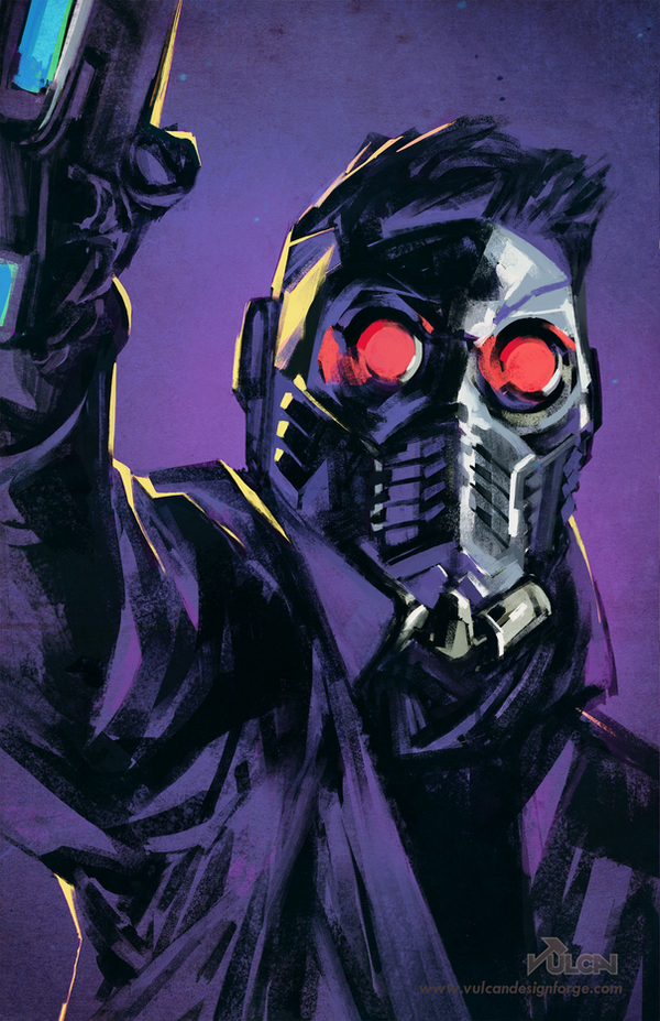
Marvel Guardians - Star Lord fan art by tomafeizogas


Marvel Guardians - Star Lord fan art by tomafeizogas

When I thought of non-commercial art, I honestly struggled to think of any art that had no connections to not making money in some way. But then I remembered the vast amount of fan made artwork that is on the internet. This is just one example of a piece made simply to show off artistic skill and to grow ones portfolio. I enjoy it for its art style of heavy shading and the mostly monochrome color scheme (of my favorite color).
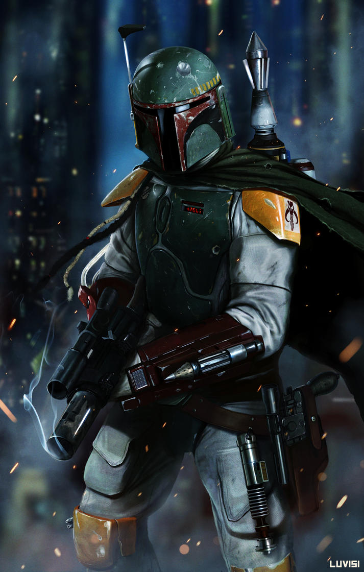
BOBA FETT - NO DISINTEGRATIONS by DanLuVisiArt
Boba Fett - No Disintegrations by DanLuVisiArt

This piece like my other example is a work of fan made art, and an honestly amazing looking one at that. When I first saw this piece I was convinced it was a picture of someone in a costume with effects added in afterwards, but that's just the kind of amazing detail that this picture is made in. It looks better every time I see it, and I think that constitutes a great piece of artwork.

Wednesday, April 18, 2018

Symbolic Colors


Art by Alex Ross for DC's Kingdom Come

If you knew nothing about any of the characters in these photos and I asked you "which were the heroes and which were the villains", what would you answer? Immediately you can tell due to the shade of lighting cast on both cast of characters. The heroes on top are basking in a warm golden light showing them in the public eye, being lit up as you monuments to societies most important figures. While on the bottom the villains are cast in a sickly green light to show how they hide from view and are more eschewed than our heroes, the green light also casts harsher shadows on them to show that they are more comfortable in a darker environment.


Still from "The Empire Strikes Back"

We all know what colors the lightsabers entail. The harsh red means that the wielder is an evil, violent, powerful sith villains. While those with the calmer blue are heroic, wise, and courageous jedi's. This is a color scheme that has become more prevalent in recent times, many think thanks to this very idea.

Wednesday, April 11, 2018

Color Discord

Image result for infinity gauntlet cover
Infinity Gauntlet cover

One of, if not my favorite cover of all time. The sheer amount of colors on display here is something to behold. The different designs of the characters, the highlighting of the lines that break up the different quadrants, and the stones of the titular gauntlet themselves being the source of said lines really tie it all together quite nicely. It really shows the scale and creativity behind an event comic such as this.

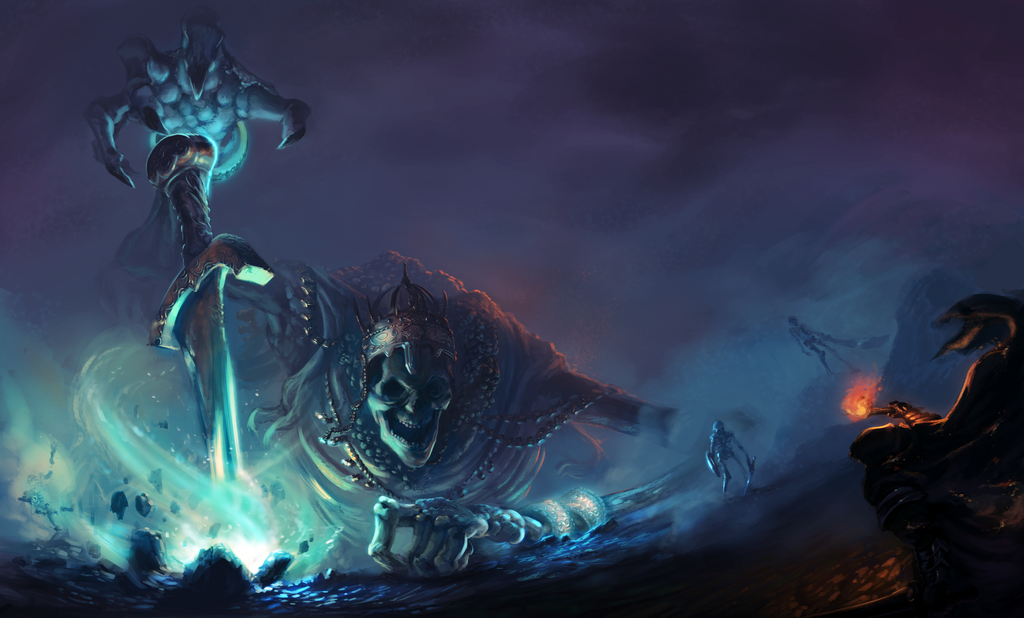
High Lord Wolnir, Dark Souls 3 by GLV-DA
High Lord Wolnir, Dark Souls 3 by GLV-DA (https://glv-da.deviantart.com/art/High-Lord-Wolnir-Dark-Souls-3-666777010)

This piece really works in displaying the scale and tone of the Dark Souls 3 boss. The blue energy coming from the right illuminating Wolnir works well to detail his image while keeping him still obscured by the dark, while the orange glow from the right from both the torch and his back collide with the blue to contrast each other well. It is a great piece of an imposing figure.


Wednesday, April 4, 2018

Creativity


Phantom City Creative Godzilla (2014) Poster

I love this poster. The colors reflect the fiery damage of Godzilla's rampage, the framing of Godzilla himself is large and imposing, and most importantly is the design. The idea of making Godzilla's shape out of smoke from the wreckage that he leaves in his wake is certainly not a new idea, but it is done so well here, both hiding his body and showing it in a different way. Its a fantastic image.


Still from Jojo's Bizarre Adventure OP 3 "Stand Proud"

The beauty in this image is the deeper meaning and references in the art. Like all of the Jojo openings from the recent adaptation, their strength is in their foreshadowing and retelling of past and future plot points of the arc's story and the series overall. Just in this image if you know the series, it has a timeline of the family at the center of the story, some major plot points/spoilers, and callbacks all the way back to the first arc of the story and then ties it into the plot of this arc of this current season. It is a tremendous work in storytelling and natural story progression.

Wednesday, March 28, 2018

Color harmony rules(!)


Spider-Man 2099 #26

When I heard "colors" as this weeks image themes, my mind immediately went to a place where I was familiar, comics. My first selection shows analogous harmony with the usage of the blues on spider man, the darker blues in the background, and the purple webs entangling him.

Related image
Avengers #57

Next up for monochromatic, a very iconic cover for the Avengers. The various shades of red give a real ominous and dangerous feeling to the cover, conveying the then unknown new villain on the scene.

Image result for jungle action 23
Jungle Action #23

Next for complimentary, I chose this cover for its usage of complementing colors. The blue and yellow go well together, and the yellow does a good job highlighting the blue like the spotlight highlights Black Panther in the image.


Incredible Hulk #372

Finally, I chose this cover for triadic. The colors of Orange on the logo, Green on Hulk himself, and the bold purple on his pants really make up the core of the image in my opinion and work together well. It may be a bit of a stretch, but I love this cover, so eh.

Wednesday, March 7, 2018

Positive/Negative space


"Peaces" of Positive & Negative Space by Lisa May

This piece of art uses positive and negative space to create a image that interacts with itself. The spaces seem to overlap and interact, it is a piece I really enjoy.

First image in the Rorschach blot test: Hermann Rorschach

I always was fascinated by the Rorschach test. Its design, its results, its meaning (if it has any), and it shows positive and negative space in my favorite way, using space to create shapes that are interpreted by the viewer. Much like those old illustrations that look different if you look at them from another angle these inkblots are very much the same, except your mind is the only limit to what you can see in the space provided.

Tuesday, February 20, 2018

Depth

Related image
Photo by Jamie Nelson (https://www.pinderful.net/pin/738159201268519624/)

Depth is shown through the focal point of the person and the framing of the environment. The blurring of the foreground also goes to enhance the focus on the person further into the picture.


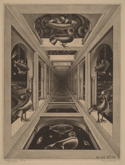
M.C. Escher "Gallery" 1946

Big fan of Escher, and a lot of his works implore some kind of depth into their overall image and this one is no exception. The framing works to draw the eye more to the focal point in the middle of the image, which seemingly pulls the viewer into its dark space.

Wednesday, February 14, 2018

Rhythm

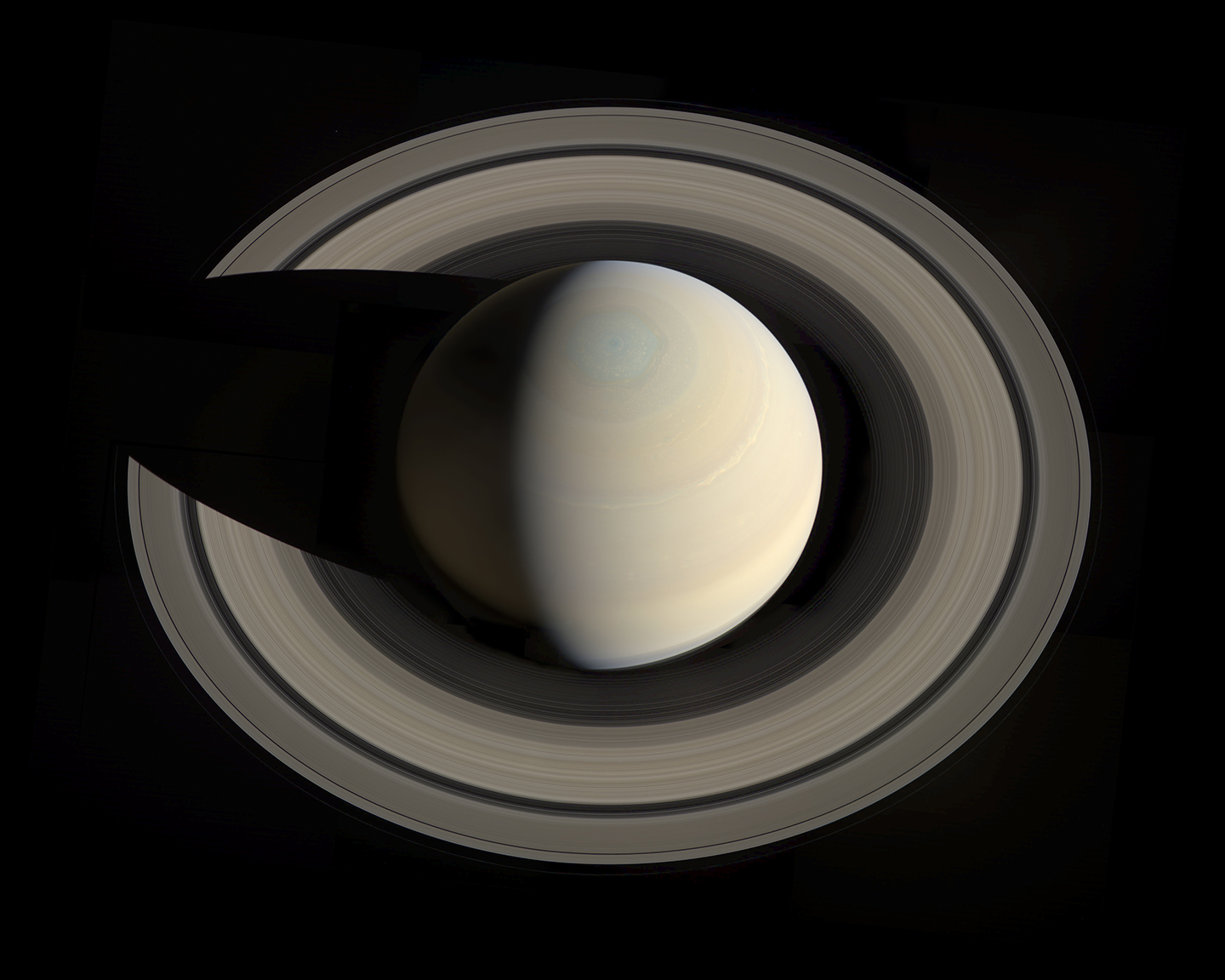
Image result for saturn cassini photos
Saturn’s North Pole, as seen by the Cassini-Huygens probe NASA

A natural occurrence of rhythm. The rings of Saturn create a repeating almost wavy pattern that exemplifies rhythm like waves on water. They also remind me of reapeating sound waves in their pattern.


From Pink Floyd's "Waiting for the Worms" video

A very striking image. Both in motion (which you should see it in motion in the video) and repetition is an exemplary form of rhythm. Also cool imagery by itself, with its oppressive overtures and totalitarian message.

Wednesday, February 7, 2018

Balance

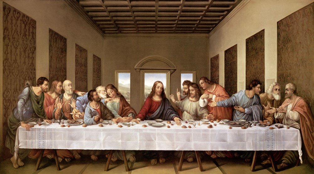
Image result for last supper
The Last Supper by Leonardo da Vinci, 15th century.

One of, if not the most recognized works of art in history is an excellent example of symmetrical balance. If you section the painting into segments, each side of the painting is equal to the other i.e. the drapery on the walls are equal to each other, the doors and windows are in the center of the frame, even the table and the space beneath it act as space serves to split and section the image equally.


30x20_tree_organ2
Mirrors by Traci Griffin

For this project, Griffin photographs trees in various places and mirrors the branches while mostly leaving out the trunks. It is an excellent example of symmetry in something that I myself had never thought of before. It is very reminiscent of a Rorschach test where the audience may see different things in the piece.

Wednesday, January 31, 2018

Unity


Unity by repetition. Unity by continuation.


Unity by repetition. Unity by continuation.


Unity by proximity. Unity by repetition.

Wednesday, January 24, 2018


This picture. I hate all the negative space. I hate the framing. I hate the themes and the message. I hate point of view. I hate how a whole body of text is floating in the air and takes up almost as much room as the guy in the picture. I also don't get the joke/message of the ad, which makes me annoyed, and I hate being annoyed. Overall, not a huge fan of this ad.